Tuesday, November 10, 2009

Conte Beautiful Conte


Hello Readers! It's been a while since I've written my last blog. However, we will continue with our talk about the Conte Crayon.

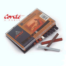
The conte crayon is one of my favorite mediums to use in art. It comes in these little square sticks, and almost has the consistency of charcoal, but it makes somewhat less of a mess than charcoal does. And it has beautiful color. My preferred color of conte crayon is actually a burnt sienna. 

Another positive attribute of conte is that it can be used with a variety of mediums. Not only can you use conte and all kinds of charcoal together in the same piece and it will work beautifully, but conte is also compatible with stubborn graphite. I say "stubborn" only because graphite and charcoal do not get along well at all. Ever try to use charcoal on a glassy surface? No matter how hard hard you press or how softly you try to tease the charcoal onto that surface, your efforts will be virtually useless. You may end up breaking the glass, but it will still remain relatively mark free. Well, this little analogy tells you exactly how charcoal reacts to graphite. The graphite just kind of sticks to the page and creates this glassy, stubborn surface that refuses to be marked by any kind of charcoal.

Last week I made a piece with sienna conte, white conte, and compressed charcoal, and it turned out just beautiful. Gorgeous. Not because I made it (no, I'm not that egotistical), but because the media just went so well together. It turned out to be an incredibly pleasing piece to look at, and I'm planning on using these three media together on a future piece. Perhaps in a future post I'll actually include pictures of my pieces for you all to admire. Or criticize, whichever you feel more comfortable doing!

Well, today I'm a bit short on time, so I'll end my post here! Thanks so much for reading! And next post won't be about something as boring as media to use in art... 


Image found here: http://www.theartshop.com.au/category20_1.htm

Monday, October 26, 2009

Media: Charcoal


Charcoal: black, messy, and not a medium you would want to use while wearing your favorite light blue sweater. Yes, love it or leave it, charcoal is a very common medium used in drawing, and probably a medium that an art teacher or professor will make you grapple with sometime during your journey through the arts. I personally swore after my first encounter with charcoal that it was the bane of my existence and that I would never touch it again. Little did I know that I would decide to major in art in college and have to use it quite a bit more than “never again.”


In this blog, I’m not going to dwell on the logistics of charcoal (yes, there are “hard” and “soft” charcoals, and there are even different types of charcoal such as vine charcoal). Instead, I’ll talk about what you can do with charcoal and the types of processes you can use when drawing with charcoal.


First of all, the type of charcoal you use will greatly affect how your piece will turn out. Using compressed charcoal will create amazing areas of rich darkness, but is harder to erase. Vine charcoal is easier to erase, but it won’t give you a rich black like compressed charcoal will, and its also much easier to remove from the page even if you put fixative on it. I prefer using compressed charcoal because I really love to play up on the contrast by pushing the dark areas as dark as the charcoal will go.


There are three different drawing processes that you can use if you are, say, drawing a still life. One process is the traditional process of drawing the basic outline of your subject and then filling it in with lights and darks accordingly. The others are not quite as simple. One is called “additive process”. This is when you start with your lightest lights (such as the highlight that can be found on that lovely bowl of fruit), and you work your way to the darkest parts of color by simply adding darker and darker shades as can be found throughout your subject. The next process involves taking the charcoal of your choice and creating a “toned ground”. This basically means you put charcoal all over your page to make it a nice medium gray tone. Then you take your vinyl eraser and your charcoal and erase and add charcoal according to where the lights and darks are in your piece. This is where choosing your charcoal comes into play. As I mentioned before, vine charcoal is easier to erase, but compressed charcoal lets you bring stunning contrast into your piece. I would suggest playing around with the different types of charcoals first if you don’t know exactly how they can be manipulated.


A word of warning when using charcoal: Don’t wear nice clothes. As I’ve mentioned before, charcoal is always very messy and after using it, you’ll find it in places that you’d think were impossible for something that you hold mainly in your hand (a few places I’ve found charcoal stains: in my hair, on my forehead, on my neck, on my shoulders… and the list only gets longer). Also, be prepared to scrub, scrub, scrub after using charcoal. Compressed charcoal is one of the most stubborn mediums I’ve ever encountered even when I’ve attacked it multiple times with soap and hot water.


In short, charcoal, although very messy, is a popular medium to use. Some love it, some hate it, and some, like myself, find that what was once an aversion slowly turns into a fondness. Charcoal can be a very fun medium to use, and is quite possibly one of the easiest, most malleable of the media.


Tune in next time to hear about the Conte Crayon!


Image found here: http://www.artsupply.com/alvin/catagory/Charcoals.asp

Media: Graphite


Today I’m going to begin a series of blogs about the various media used in drawing, since this information is very handy to have as an artist.

The first tool that is usually thought of when considering drawing is the pencil, or graphite pencil, as we artsy folk like to call it. Note that a No. 2 pencil is not the same as a graphite pencil. When choosing which pencil to use, a few things must be considered, namely, the type of marks that you wish your pencil to make. Let me explain: Graphite pencils come in different degrees of softness and hardness. “H” generally denotes “hard”, while “B” stands for “soft”. If you go into an art store, you’ll see a whole bunch of pencils that pretty much look the same, but are separated into different categories. They are separated by the hardness or softness of the graphite. If you pick up one of the pencils, you’ll notice that on the end of the pencil it may say something like “2H”. Okay, well since you already know that “H” means “hard”, you assume that this is a hard pencil. Picking up another pencil, you see that this one says, “6H”. Basically, to make a potentially long story short, graphite pencils are sorted, as I said, according to their hardness or softness. The number in front of the letter indicates how much of the hardness or softness there is. For example, 2H is softer than 6H, but 2B is harder than 6B. There is one graphite pencil that doesn’t stick to the number/letter rule, and that is the HB pencil. This is basically the pencil that is equally as hard as it is soft.

Now, I know that some of you may be thinking (as I once did), “what’s the big deal? Why can’t I just use one normal pencil?” Well, different pencils make different lines. The harder a pencil is, the lighter, thinner, and less easily erasable the line is. Conversely, the softer a pencil is, the darker, and thicker the line is. Softer pencils are also better for shading and blending, topics that I will cover in other blogs. So, all in all, the kinds of graphite pencil you use in your art counts! However, much of which pencil artists like to use best depends on personal preference. I am a 2B or 4B person myself, because I usually erase often and I’m a fan of shading.

Since I think I’ve said all there is to say about graphite, I’m going to say farewell until next time, when we’ll learn about Charcoal, the messiest but most malleable of the media.


Image found here: http://www.thisnext.com/item/4ECD02B4/CBA57999/Faber-Castell-Graphite-Pencils

Saturday, October 24, 2009

Perfectionism


Today I've been doing some more work in my sketchbook. I like how it's turned out so far, and I'm excited to see what it will look like at the end of the semester! When I first began drawing, I didn't realize how much technique is involved in art. I also didn't know that there are actually six parts of light instead of only three. I also didn't know that it was possible to measure out an exact angle with only a pencil and an outstretched arm.

Since I had always nurtured the whimsical, imaginative side of my artistry, it was hard for me to start applying all of these technical methods to my art. For example, learning how to make a 50% gray tone and how to match tones when you're dealing with different colors. It's true that creating art requires a skilled hand, but it also requires an even more critical eye. I find myself having to pay attention to little things that usually go unnoticed, like the
reflected light that is found in a shadow, or the minute differences in shade and texture that can be found in a still life.

I find that I also have to be very critical in my way of looking at what I am drawing as a whole. For example, someone who is very adept at drawing doesn't always create good works of art because they may be lacking in composition. Composition is something that I've struggled with as well. Sometimes where you decide to place a certain object in your drawing can make or break the entire piece. Even the smallest shift in the placement of object on your page could change the look of your drawing.

I guess it's a good thing that when it comes to my art, I'm a perfectionist!


Image found here: http://opinionsandexpressions.wordpress.com/2009/05/24/mein-apni-favorite-hoon/

Monday, September 21, 2009

Mayhem, Mishaps, Masterpiece


As an intended art major at Trinity, life has  begun to offer many interesting lessons. Since starting my art classes, I have stumbled across a couple of great examples of what and what not to do when you are faced with a deceptively easy art project...


First lesson: Don't wait until the day or night before class to start an art project, no matter how simple you think it might be. Art always ends up taking longer than you expect. Example: One of my first art assignments in an art class this semester was to show four different types of symmetry using black squares on white bristol board. Sounds easy, right? It wasn't, as I soon found out when I was frantically working into the wee hours of the night the day before the project was due. Tip: Procrastination never helps...


Lesson number two: Always have a Plan B. Example: Tonight I was working on an art piece that involves creating a wire representation of an object of my choice. I had decided earlier in the week that I was going to replicate a belt of mine. Again, this task proved a bit harder than I had anticipated. After an hour or two of painstakingly crafting this wire belt, it snapped in half. I tried to weld the belt back together, but I had used the wrong type of wire and the solder wouldn't stick. Of course I was very upset and extremely frustrated, but I thought that perhaps I could try to make another belt that was more structurally sound. Three lengthy attempts at this proved that I had no idea how to create a life-size belt made out of wire that would hold together and wouldn't break apart. Luckily, I had a plan B.


To make a long story short, I ended up trying to construct a makeup brush of sorts, which also ended up falling apart on me twice. It seems to have held together well so far, and now, because of my plan B (and, I admit it, some hasty improvisation), I have a completed piece of art that I think turned out pretty cool for all the trouble I had.


Image found here: http://www.anyonecanpaint.com/studio.htm